Improvements for mobile browsing on new website
on Tuesday March 7, 2017 02:05PM
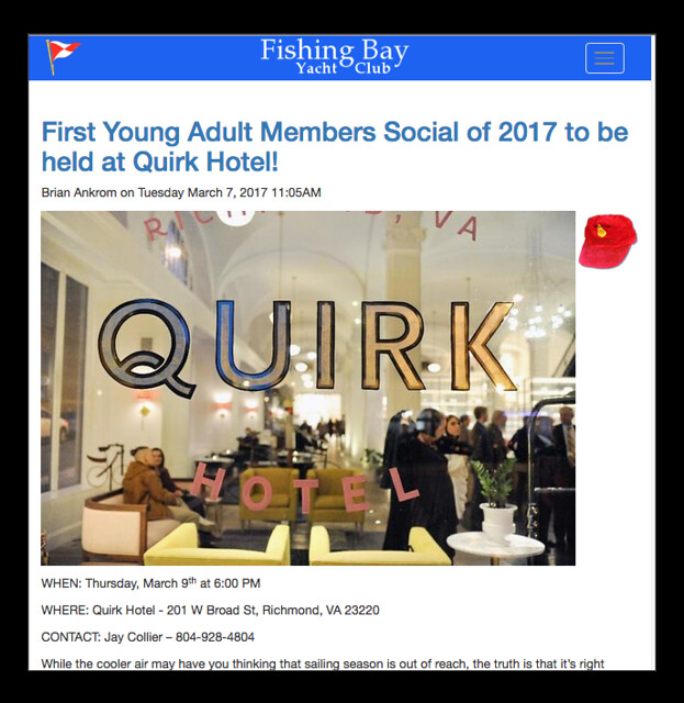
At long last, we have a new header on the top of https://new.fbyc.net that is colorful and responds to mobile devices. Both of our websites https://www.fbyc.net and https://new.fbyc.net will continue to look the same on a computer, but when you visit the new site on a mobile device, you will see a different look.
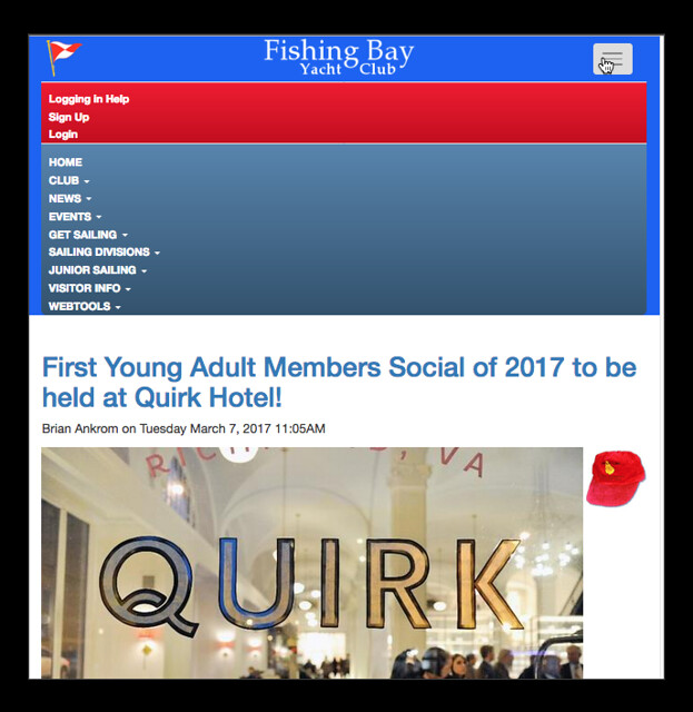
 The top of the page will have a blue bar, with a burgee on the left, and a “hamburger” icon on the right. Click on the icon and it opens the navigation menu - seen in second image.
You will likely see the header when you register for an event on your phone or tablet. I want you to be aware of the change so you won’t be surprised. The design is similar to what you see on the IOS App, so it gives some consistency to our brand.
If anyone sees an issue or problem, please let Strother know ASAP. I thank member Anthony R. Johnston who agreed to do this design and coding work for the Club. Anthony is a Laser sailor, parent of junior sailor Katherine, and crews with David Clark. (He recently finalized his divorce and has legally taken his own name back and dropped the married name Burton.)
Tags: website
